[Graphics] Gokudera Coloring
fuwacchi asked me for the basics on coloring and the easiest way to do that is through a quick tutorial so I can show what I mean instead of confusing you. Heh. So here goes nothing~ It should be translatable since I’m using Photoshop 5.0, but let me know if anything confuses you - or, well, there could be easier ways of doing some of this if you have a newer version.
Time taken to complete: ~2 hours
1. First off, you were right. The images you gave me for your b-day were difficult to use for standard coloring, so I went with this. There’s a lot more white space and … well, this is a perfect excuse for me to color a Gokudera picture, haha. All right, on to the tutorial. To start with, I always right click, duplicate the base layer, and set it to multiple. Then, duplicate it again and set it to screen. Afterwards, merge visible layers and then duplicate the base once more and set it to multiple. Merge visible layers one more time. It should look something like this now:
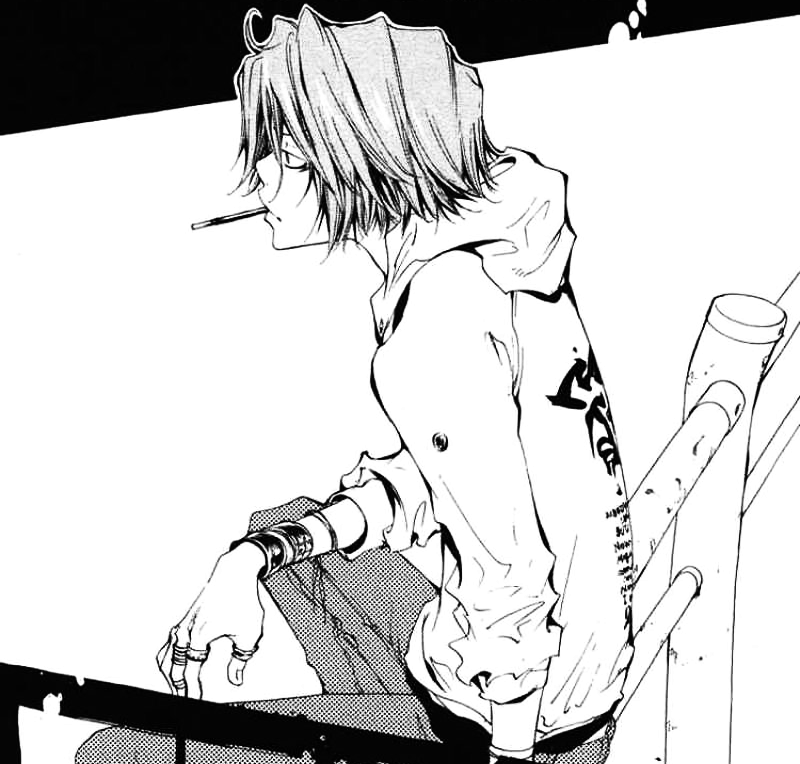
2. Next, I touch up what needs fixing. For this picture, it would be smoothing out Gokudera’s hair and pants with the smudge tool.
The best way to do that is magnifying to 200 %, same with cleaning. This step I think you already know, haha~ On to step 3!
3. As you can see, the smudge bits look kind of … bleh. So let’s fix that now by making a new layer on screen (Shift+Ctrl+N). Pick a color for the pants (I used 202b43) and color over the shaded parts on the layer you just made. Make another layer on screen and do the same for the hair. Or, in this case, leave it alone since the hair color is already going to be gray. Repeat as necessary for other parts that need screened colors. It should look something like this once done:
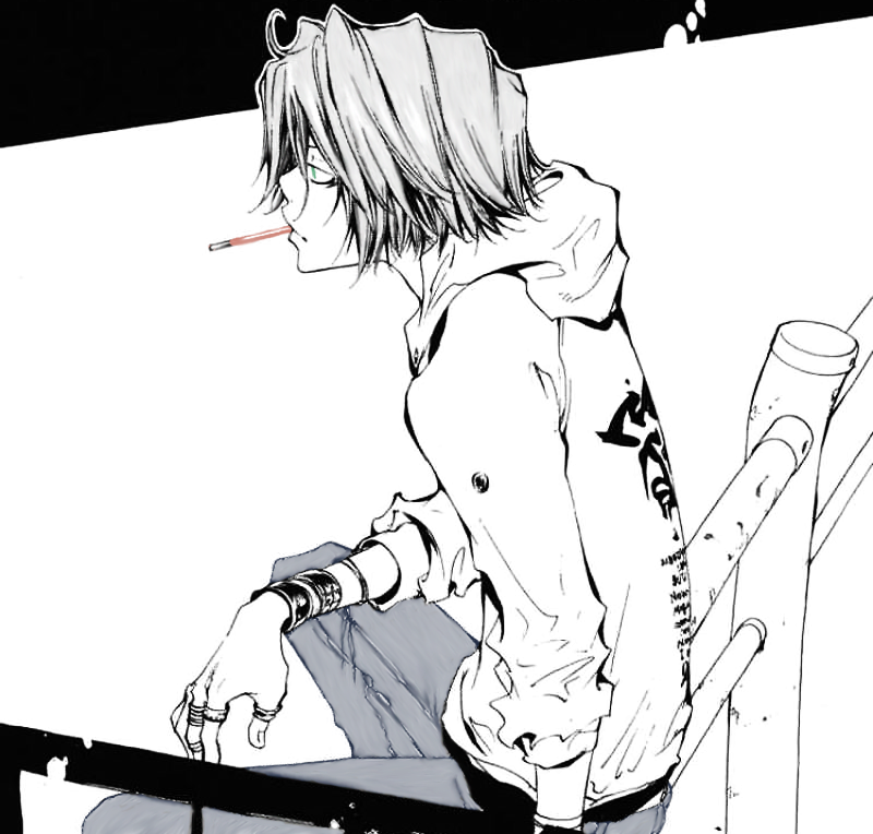
4. Now, on to the fun part! The actual coloring. I like to start with the smaller things first and then work my way up. In this case, I would start with the pocky stick and the accessories and then work on the clothes. To begin with, though, make a new layer on multiple. Then it’s just a matter of making a layer for each color you’re going to use, set on multiple. Once done coloring the accessories and other odds and ends, you’ll notice they look a little bland. I usually go back and abuse the dodge and burn tools to add shadows and highlights where they’re needed.
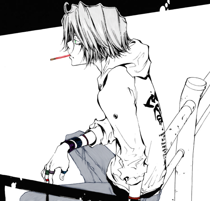
5. With all those small parts out of the way, it’s time to focus on the background. I used a light blue for the background (a1b0e2) and a light gray (c8c8c8) for the poles. Both separate layers on multiple again. I set dodge on Highlight 42 % to add light where needed on the poles and burn to Midtones 45 % for shadows. For blending, just use smudge again.
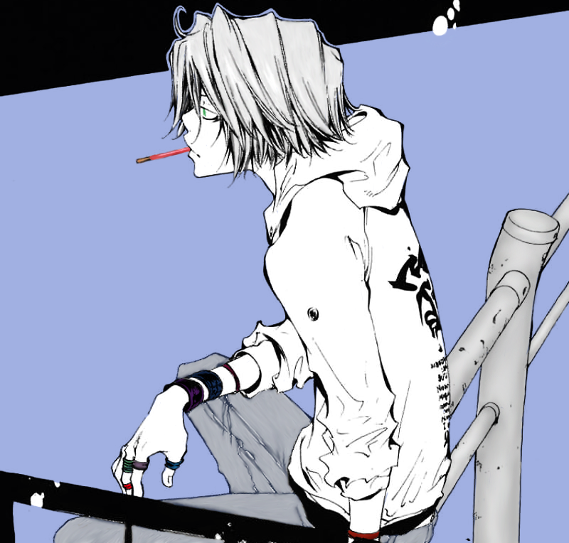
6. That just leaves clothes before heading onto skin tone and hair. Same thing as the last two steps: set a layer on multiple for each color you’ll need. Once the base colors are down, it’s time to pick a lighter color and go back over the parts that will be in the light. Pick a darker color after and go back to add shadows. Then use smudge to blend them together. This step is more of a trial and error process. Finding colors, figuring out what should go where. Play around until you like what you see.
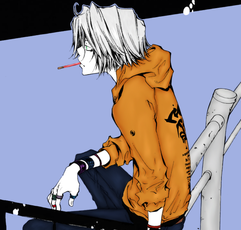
7. Okay, hair color next. Make a new layer, set it on multiple, put down your base color and then get ready to add highlights and shadows once more. The easiest way to do that is yet again to use the dodge and burn tools. Pick the smallest setting for your brush (2px or 3px) and go down in a straight line from where the hair starts to where it ends. Try not to overlap the two. You’ll want to set the dodge on Highlight once more, anywhere between 20 and 30 %. For burn, it’s fine to leave it on Midtones 45 %. And since I like to abuse the dodge tool, I often reset the size to 10px or higher and increase the Highlight to about 50 or 60 %. Then I add that extra light by sweeping the brush in an arc across the hair.
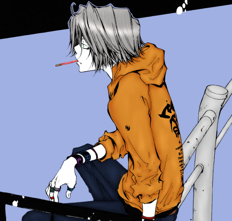
8. Lastly, skin tone! I tend to use f9d4b7 and go from there. Make a new layer again and set it to multiple. You can change the opacity later, as well as go to ‘Enhance -> Adjust Color -> Adjust Hue/Saturation’ to fix the color if it seems too dark or light for the character. Once the base color is laid down, you’ll want to do the same thing as the clothes and find a color lighter and darker than your base. If you want to add a blush or just extra hints of red, make a new layer and leave it on normal. Pick a red hue that you like and color the area you want to add the red to. Then, go to ‘Filter -> Blur -> Gaussian Blur’ and blur it until you like the effect. To add white dots, either make a new layer on normal or erase parts of the skin in a circular shape.
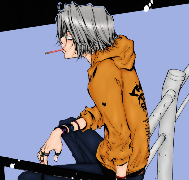
9. And that’s it! All that’s left is to play around with the picture's Hue/Saturation if you’re not satisfied and add textures to your heart’s content. Once finished, my Gokudera coloring looks like this:
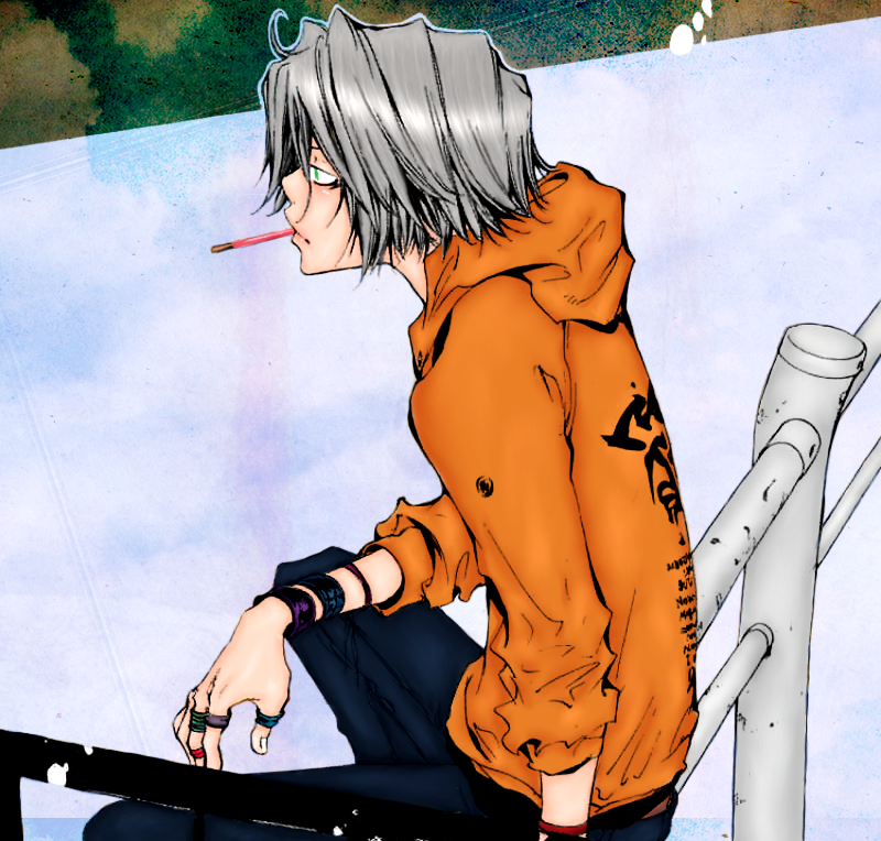
If you have any questions, feel free to ask them here. Especially if you need any help finding any of the tools mentioned, etc. Again, not the best, but still learning! I hope I could help you, if even a little bit, Fuwa~ And good luck with icon-making!
Time taken to complete: ~2 hours
1. First off, you were right. The images you gave me for your b-day were difficult to use for standard coloring, so I went with this. There’s a lot more white space and … well, this is a perfect excuse for me to color a Gokudera picture, haha. All right, on to the tutorial. To start with, I always right click, duplicate the base layer, and set it to multiple. Then, duplicate it again and set it to screen. Afterwards, merge visible layers and then duplicate the base once more and set it to multiple. Merge visible layers one more time. It should look something like this now:

2. Next, I touch up what needs fixing. For this picture, it would be smoothing out Gokudera’s hair and pants with the smudge tool.
The best way to do that is magnifying to 200 %, same with cleaning. This step I think you already know, haha~ On to step 3!
3. As you can see, the smudge bits look kind of … bleh. So let’s fix that now by making a new layer on screen (Shift+Ctrl+N). Pick a color for the pants (I used 202b43) and color over the shaded parts on the layer you just made. Make another layer on screen and do the same for the hair. Or, in this case, leave it alone since the hair color is already going to be gray. Repeat as necessary for other parts that need screened colors. It should look something like this once done:

4. Now, on to the fun part! The actual coloring. I like to start with the smaller things first and then work my way up. In this case, I would start with the pocky stick and the accessories and then work on the clothes. To begin with, though, make a new layer on multiple. Then it’s just a matter of making a layer for each color you’re going to use, set on multiple. Once done coloring the accessories and other odds and ends, you’ll notice they look a little bland. I usually go back and abuse the dodge and burn tools to add shadows and highlights where they’re needed.

5. With all those small parts out of the way, it’s time to focus on the background. I used a light blue for the background (a1b0e2) and a light gray (c8c8c8) for the poles. Both separate layers on multiple again. I set dodge on Highlight 42 % to add light where needed on the poles and burn to Midtones 45 % for shadows. For blending, just use smudge again.

6. That just leaves clothes before heading onto skin tone and hair. Same thing as the last two steps: set a layer on multiple for each color you’ll need. Once the base colors are down, it’s time to pick a lighter color and go back over the parts that will be in the light. Pick a darker color after and go back to add shadows. Then use smudge to blend them together. This step is more of a trial and error process. Finding colors, figuring out what should go where. Play around until you like what you see.

7. Okay, hair color next. Make a new layer, set it on multiple, put down your base color and then get ready to add highlights and shadows once more. The easiest way to do that is yet again to use the dodge and burn tools. Pick the smallest setting for your brush (2px or 3px) and go down in a straight line from where the hair starts to where it ends. Try not to overlap the two. You’ll want to set the dodge on Highlight once more, anywhere between 20 and 30 %. For burn, it’s fine to leave it on Midtones 45 %. And since I like to abuse the dodge tool, I often reset the size to 10px or higher and increase the Highlight to about 50 or 60 %. Then I add that extra light by sweeping the brush in an arc across the hair.

8. Lastly, skin tone! I tend to use f9d4b7 and go from there. Make a new layer again and set it to multiple. You can change the opacity later, as well as go to ‘Enhance -> Adjust Color -> Adjust Hue/Saturation’ to fix the color if it seems too dark or light for the character. Once the base color is laid down, you’ll want to do the same thing as the clothes and find a color lighter and darker than your base. If you want to add a blush or just extra hints of red, make a new layer and leave it on normal. Pick a red hue that you like and color the area you want to add the red to. Then, go to ‘Filter -> Blur -> Gaussian Blur’ and blur it until you like the effect. To add white dots, either make a new layer on normal or erase parts of the skin in a circular shape.

9. And that’s it! All that’s left is to play around with the picture's Hue/Saturation if you’re not satisfied and add textures to your heart’s content. Once finished, my Gokudera coloring looks like this:

If you have any questions, feel free to ask them here. Especially if you need any help finding any of the tools mentioned, etc. Again, not the best, but still learning! I hope I could help you, if even a little bit, Fuwa~ And good luck with icon-making!