.001 TUTORIAL ron/hermione
this to this: 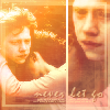
in PSP9.
I started out with this screencap from teh_indy. I cropped & resized it.
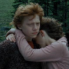
It's very dark, dull, and boring. So I went to the Brightness/Contrast settings (shift+b) to spice it up a bit. Every picture is different and need different settings to make it look like you want it. I recommend you just mess around with it until you get your desired result.
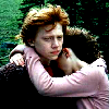
I got this.
Then I duplicated it twice. The first duplicate I blurred (Adjust>Blur>Blur) and set the opacity to 54%. The second duplicate I set to Soft Light. This kind of gives the image a glowing effect. Then go to Layers>Merge>Merge Visible and add a new layer (Layers>New Raster Layer). I added this image that I cropped & resized from the original one.

I mirrored it (Image>Mirror) and did the same steps as before. Set the Brightness/Contrast, duplicated it twice, blurred the first & set it to 54%, set the second duplicate to soft light, and merged the 3 layers of just that. Then I moved the bottom layer to the left a little bit and got this.
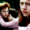
Add a new layer and select a LIGHT color from your image. I used #FAF5FB and make a vertical line where the two pictures meet. Then I added these two gradients by colortone
01.
02.
I set the first one to hard Light, 100% opacity and the second one to Screen, 100%.
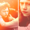
Then I duplicated the whole image (shift+d) and merged visible. Then I went to Adjust>Brightness/Contrast>Histogram Stretch (shift+t). Then I went to Automatic Color Balance (Adjust>Automatic Color Balance). I set the strength to 72 and the temperature to 4639. Copy the image and paste it on the original icon on a new raster layer between 1st gradient and the 2nd one. Set it to Luminance at 100% opacity.
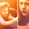
Ok. Now time for the Textures, Brushes, and Text!
I used this brush:
by september_icons. I picked a color from the picture (#FE8F35) and put it on a new raster layer below the 2nd gradient, set it to screen, and made the opacity 50%.
Then I added a new layer on top and put in some tiny text. I used Tahoma, bold, 1pt, Kerning 100, and Anti-Alias set as Sharp. Choose a color from your picture, i used #FFD499 and place it where you think it would look good. And just for them curious people (if there are any) the tiny text says
"Looking in your eyes, I see a paradise.
This world that I found is too good to be true." Lyrics from The Starting Line; Nothing's gunna stop us. Good song... you should listen to it.
This is what i have so far:
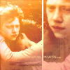
.
Then I added more text right about the tiny text on a new layer. It says (hopefully you can read it) "never let go" in Mistral, same color as the tiny text. Then I went to Effects>3D Effects>Drop Shadow. I used #BB5534 and set the opacity to 93 and blur to 1. Click OK. Then I set the layer to 80% opacity.
Then I added this brush:
and I do not know who made it so if you know please tell me so i can credit them.
Once again add a new layer and pick a color from your picture, i used #FEE48E. Set the brush to Screen, and opacity 50%.
this is the finished icon:
Okay that was my first tutorial, but I'm not sure I really like the icon. Maybe someone else will. And I would love to see what you made ♥ Comments are always nice... because they make me smile...

in PSP9.
I started out with this screencap from teh_indy. I cropped & resized it.

It's very dark, dull, and boring. So I went to the Brightness/Contrast settings (shift+b) to spice it up a bit. Every picture is different and need different settings to make it look like you want it. I recommend you just mess around with it until you get your desired result.

I got this.
Then I duplicated it twice. The first duplicate I blurred (Adjust>Blur>Blur) and set the opacity to 54%. The second duplicate I set to Soft Light. This kind of gives the image a glowing effect. Then go to Layers>Merge>Merge Visible and add a new layer (Layers>New Raster Layer). I added this image that I cropped & resized from the original one.

I mirrored it (Image>Mirror) and did the same steps as before. Set the Brightness/Contrast, duplicated it twice, blurred the first & set it to 54%, set the second duplicate to soft light, and merged the 3 layers of just that. Then I moved the bottom layer to the left a little bit and got this.

Add a new layer and select a LIGHT color from your image. I used #FAF5FB and make a vertical line where the two pictures meet. Then I added these two gradients by colortone
01.

02.

I set the first one to hard Light, 100% opacity and the second one to Screen, 100%.

Then I duplicated the whole image (shift+d) and merged visible. Then I went to Adjust>Brightness/Contrast>Histogram Stretch (shift+t). Then I went to Automatic Color Balance (Adjust>Automatic Color Balance). I set the strength to 72 and the temperature to 4639. Copy the image and paste it on the original icon on a new raster layer between 1st gradient and the 2nd one. Set it to Luminance at 100% opacity.

Ok. Now time for the Textures, Brushes, and Text!
I used this brush:

by september_icons. I picked a color from the picture (#FE8F35) and put it on a new raster layer below the 2nd gradient, set it to screen, and made the opacity 50%.
Then I added a new layer on top and put in some tiny text. I used Tahoma, bold, 1pt, Kerning 100, and Anti-Alias set as Sharp. Choose a color from your picture, i used #FFD499 and place it where you think it would look good. And just for them curious people (if there are any) the tiny text says
"Looking in your eyes, I see a paradise.
This world that I found is too good to be true." Lyrics from The Starting Line; Nothing's gunna stop us. Good song... you should listen to it.
This is what i have so far:

.
Then I added more text right about the tiny text on a new layer. It says (hopefully you can read it) "never let go" in Mistral, same color as the tiny text. Then I went to Effects>3D Effects>Drop Shadow. I used #BB5534 and set the opacity to 93 and blur to 1. Click OK. Then I set the layer to 80% opacity.
Then I added this brush:

and I do not know who made it so if you know please tell me so i can credit them.
Once again add a new layer and pick a color from your picture, i used #FEE48E. Set the brush to Screen, and opacity 50%.
this is the finished icon:

Okay that was my first tutorial, but I'm not sure I really like the icon. Maybe someone else will. And I would love to see what you made ♥ Comments are always nice... because they make me smile...